Interpreting graphs: the red-blue coronavirus divide
June 28, 2020
I recently saw this graph floating about the internet, and it has some interesting properties that I thought might warrant a new type of post, where I dive into interpreting a particular figure and see where it takes me.
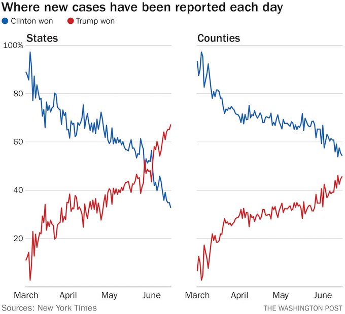
The graph we are looking at todayUnfortunately the associated article for the figure is behind a paywall, but I’ve read some of the Twitter discussion has two panels, showing similar trends. On the left is a plot of the percentage of new cases of COVID-19 (vertical axis) occurring in either “blue states” (i.e. states that voted for Hillary Clinton in the last presidential election) or “red states” (i.e. those states that voted for Donald Trump). These percentages are shown as they vary through time (horizontal axis). On the right, we see a similar trend for “blue” and “red” counties.
In both cases, we see that the blue line is dropping while, the red line is climbing. For the states panel, we even see a crossing of the lines – there are more new cases in red states than there are in blue states each day over the past week or so.
The responses I have seen fall into a few main campsI’ll let you intuit how these responses correlate with political preference as well:
- This is due to differences between republican and democrat policies/beliefs/behaviors in response to the pandemic
- This is a red herring, and distorts the picture that there have been many more cases in blue states than red states
- This is a result of demography, including population movement and density
And, of course, it bears stressing that these explanations are not mutually exclusive.
There are some important issues to keep in mind when looking at this plot. First, recall that the
vertical axis is not the number of new cases, but rather the percentage of new cases belonging to
each of these two groups. This means we have no information on whether the absolute number of new
cases is going up, down, or staying steady overall, or within either groupAll that we can know is whether or not the rate of change in red county cases is faster than the rate of change in blue counties. If the percent of new cases coming from red counties is increasing, it could be that both rates are increasing, but red counties are increasing faster, or that blue counties are holding steady while red numbers increase, or that both are decreasing, but blue counties are decreasing more quickly, just to name a few.. Second, these data
have been divided into groups of unequal size: there are more states and counties that voted for
Trump than for Clinton in the last election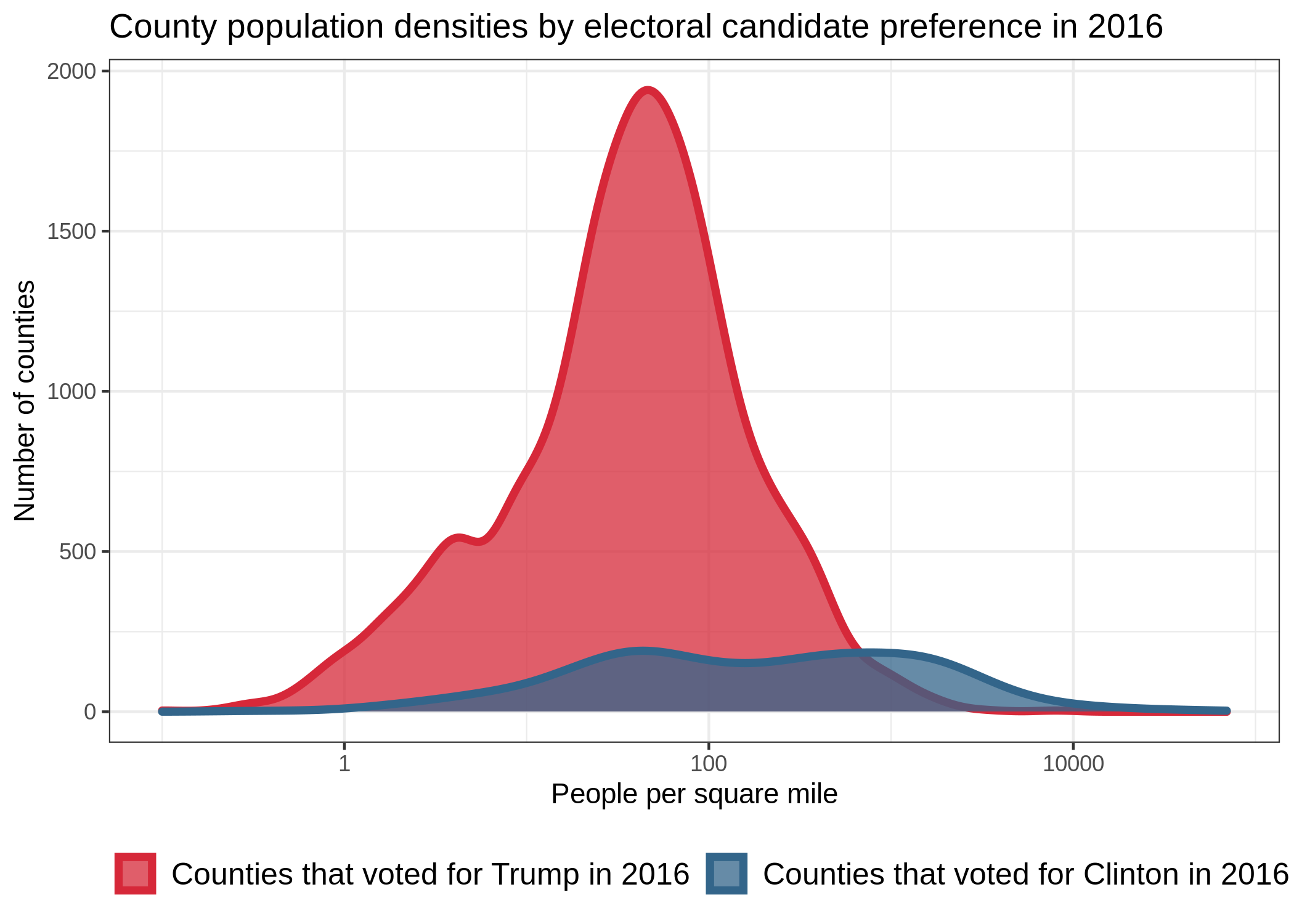 .
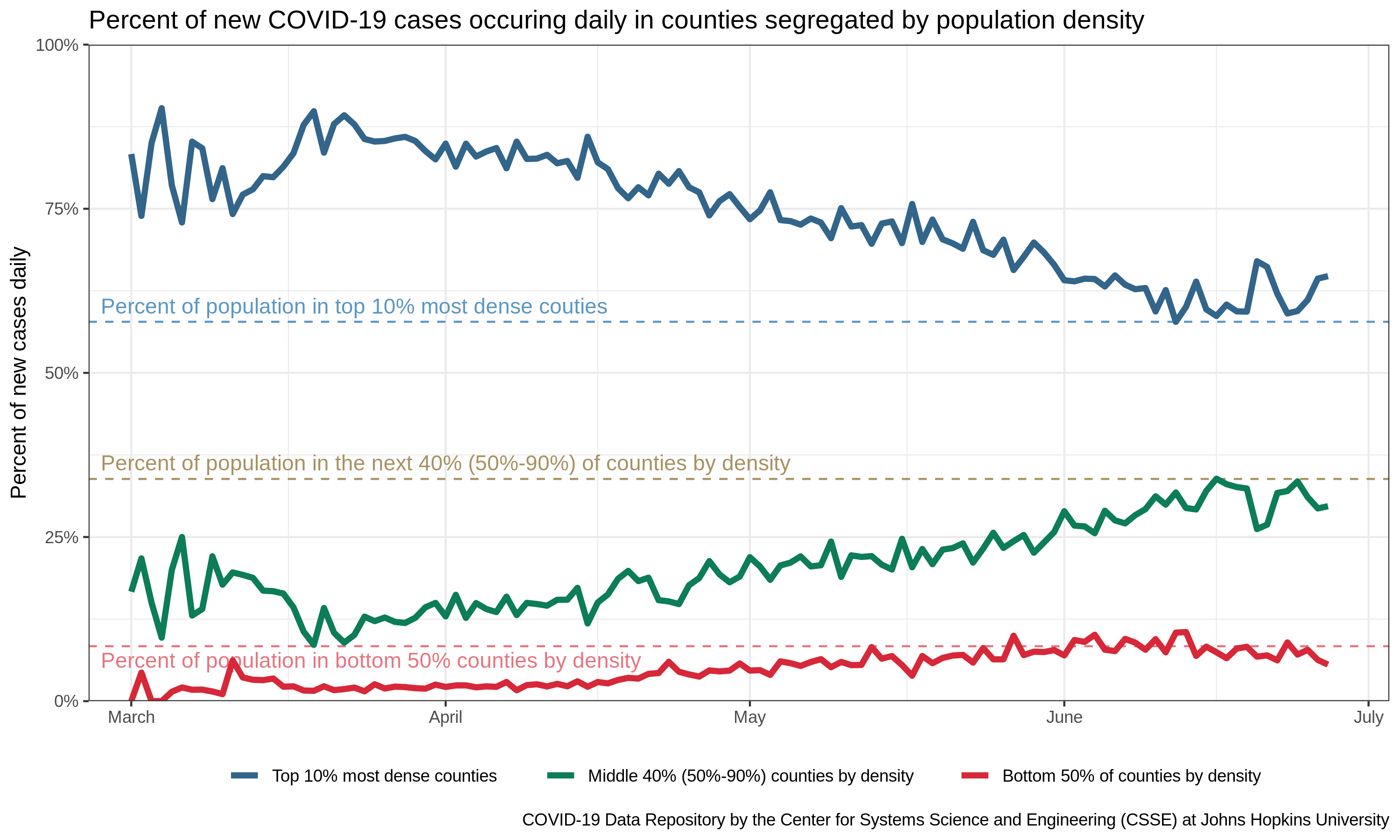
Note that nearly 85% of counties voted for Trump (as opposed to Clinton) in 2016, but that the
counties that voted for Clinton tend to have more people in them. Though the log-scaling of the
horizontal axis in the figure to the right can be deceiving here, consider that of the top 100 most
dense counties, 89 of them went blue. The issue of unequal sample size is particularly important in
statistics when it correlates with other variables that might contribute to explaining the pattern
of interest. In this case, we note that political party preference seems to correlate with
population density.
.
Note that nearly 85% of counties voted for Trump (as opposed to Clinton) in 2016, but that the
counties that voted for Clinton tend to have more people in them. Though the log-scaling of the
horizontal axis in the figure to the right can be deceiving here, consider that of the top 100 most
dense counties, 89 of them went blue. The issue of unequal sample size is particularly important in
statistics when it correlates with other variables that might contribute to explaining the pattern
of interest. In this case, we note that political party preference seems to correlate with
population density.
Forming an expectation
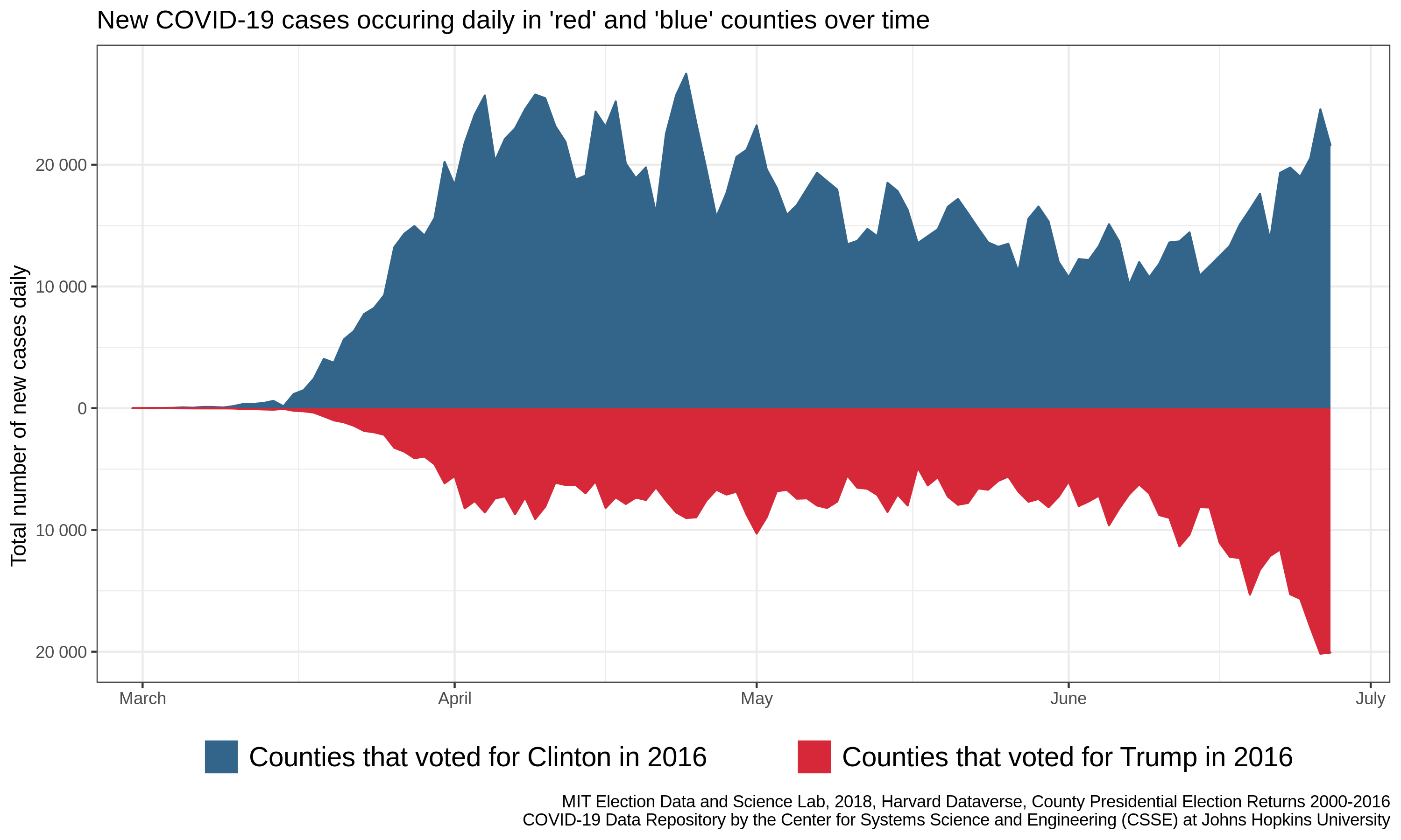
A key step in interrogating new data is to come up with an idea of what you expect the data to look likeIdeally with some logical justification. If politics had no bearing on COVID-19, what would we expect to see? If each person has an equal likelihood of getting sick, regardless of their political orientation, then the new daily cases would be distributed across the county as people are: more populous places would have more cases each day, and less populous places would have fewer. Here I have recreated the counties portion of the original figure using publicly accessible dataData sources provided at the end of this post. To simplify the message, I’ll focus on the county level data for this post.
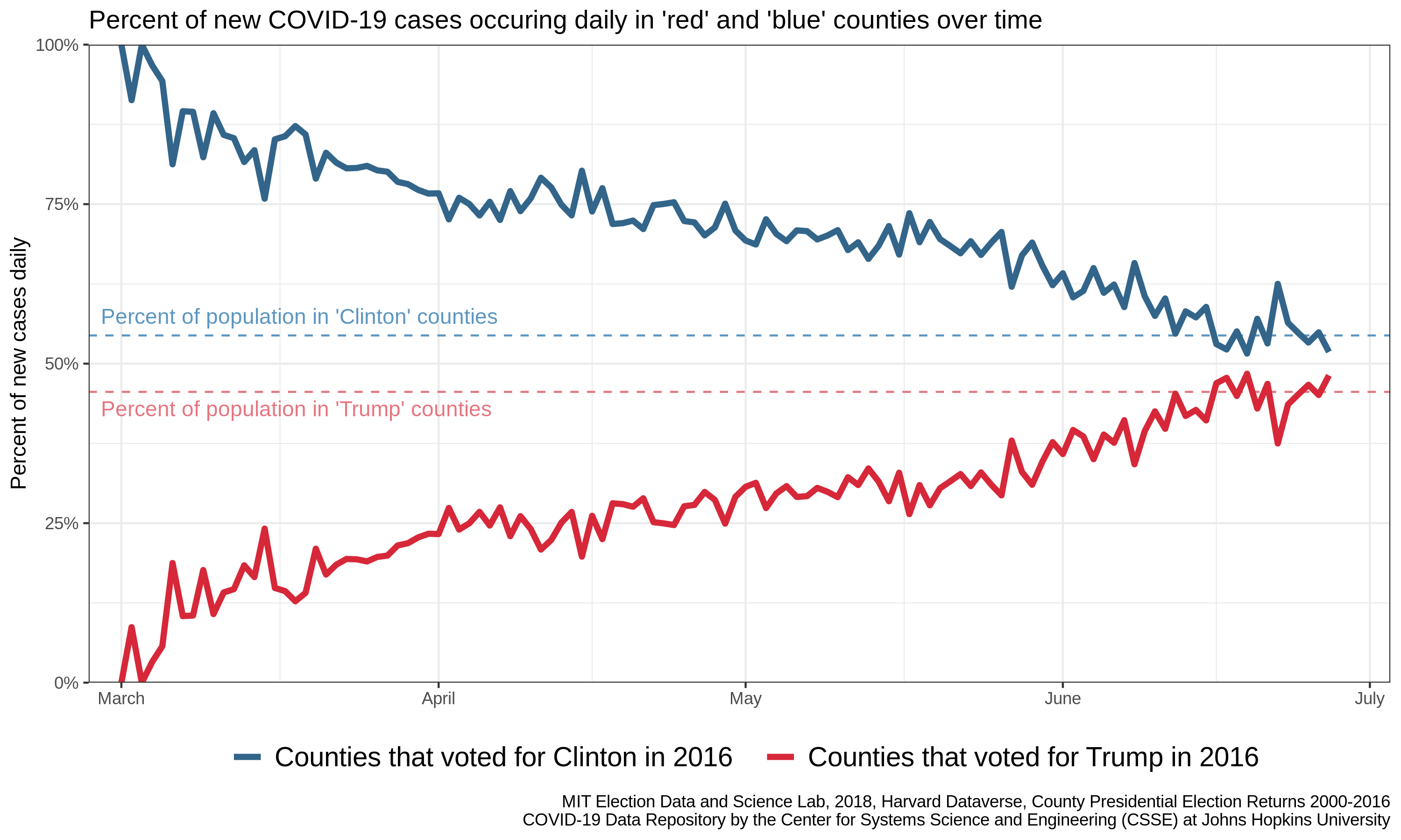
Note that I have added two lines corresponding to our expectation of no difference. If every individual had the same risk of infection (independent of political preference), we would expect the percentages of new cases in blue and red counties to converge to these lines, which indicate the proportion of the population that lives in red and blue counties.
Another way to measure the effect of one variable on another (e.g., the uneven distribution of people in space on disease prevalence), is to remove the expected effect through normalization. Here, we can try to remove the effect of differing population sizes by converting the counts of new cases daily to the number of new cases per capita daily. As mentioned in previous posts, this is done through dividing the number of new cases in each county by the population of that county. In this way, we make counties more comparable by removing a known difference.
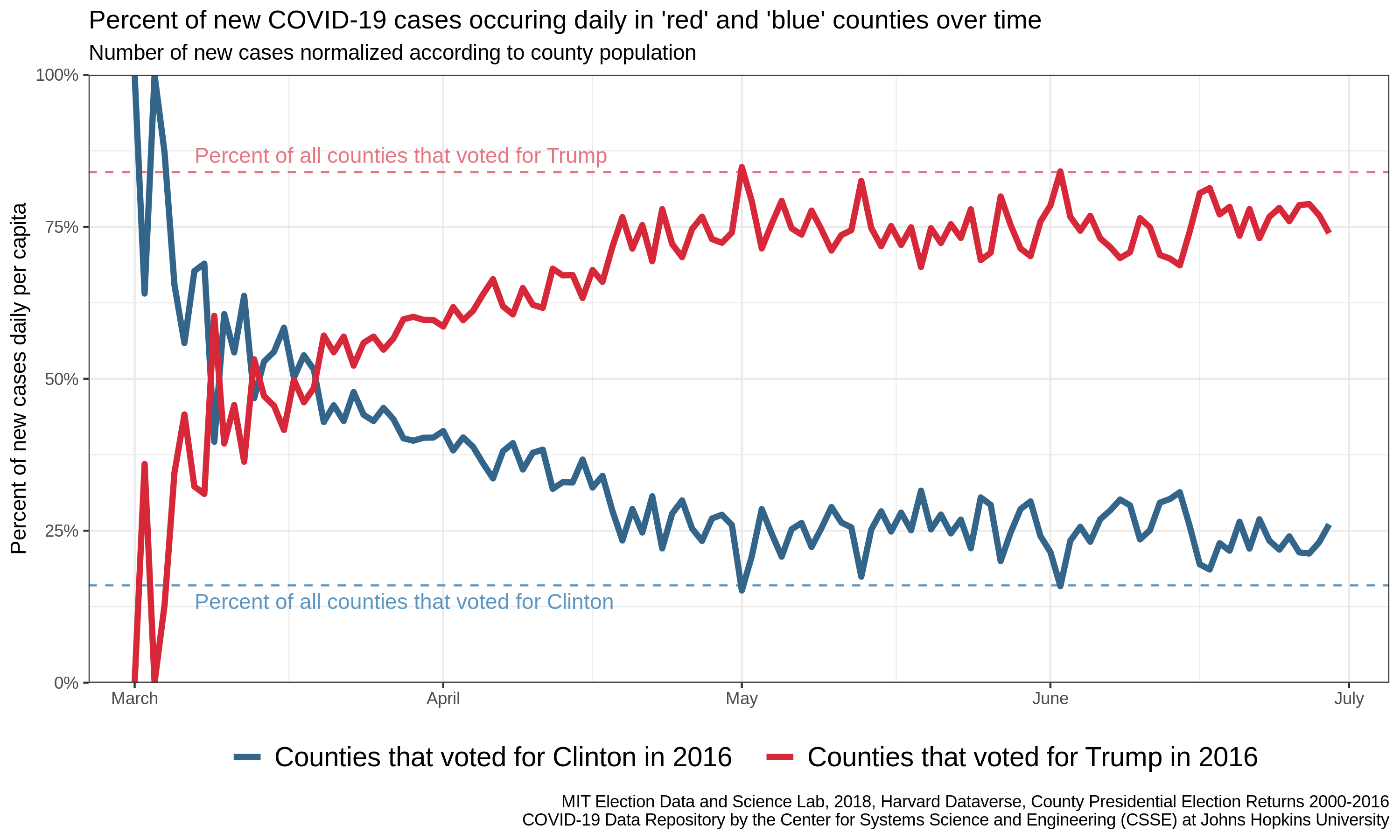
Note that the definition of our expectation is now in terms of counties, rather than people. This is because we have attempted to make all counties approximately equal in their contribution to the total number of new cases each day. In other words, in the absence of further variables of importance, we expect that the contribution of red counties should be proportional to the number of counties that are red (and likewise for blue counties). Note that this convergence is not complete: there are more per-capita-cases than expected in blue counties and fewer than expected in red counties – the opposite of what we would have expected from the original plot. This suggests our normalization did not account for all of the differences in cases between blue and red countiesKeep your eyes peeled for an upcoming post looking at the best normalization for COVID data (spoiler alert: it involves density). We don’t know from this analysis, however, if that difference is something inherently political (i.e. relating to policy differences) or some further demographic difference.
So what is going on here?
If the story is mostly to do with population, why hasn’t it always been this way? In other words, why does the plot start out with almost all of the new cases in blue counties? My explanation here is a bit hand-waving, as I don’t have data to suggest this is the actual course of events, but I would posit that what we are seeing is the effects of a slow diffusion of the disease out of the major cities (where it was first introduced due to a higher rate of international travel) and into the surrounding countryside. In fact, this interpretation holds if you break up the data according to population density (rather than political affiliation).
Why should we prefer one explanation to the other? That is, since political preference and population density are so highly correlated, why should we think that this difference is due to population density, rather than behavioral differences that are informed by one’s politics? Because of a scientific principle termed “Occam’s razor” – a formalization of scientist’s preference for simpler explanations. Demography clearly has some effect on disease spread, meaning that even if political affiliation is a contributing factor, it would have to be in addition to demographic processes. Thus, if the choice is between just demography or demography plus something else (and both theories have the same degree of success in explaining the pattern), the former is almost always preferred.
Take note!
Importantly, none of the above graphics suggest that the daily number of new cases is declining. These are all discussions about the relative rates in red/sparse and blue/dense counties. Indeed, the number of new cases being reported each day is rapidly increasing in both red and blue counties, and it is up to each of us to do our part to limit disease spread, especially to those most vulnerable in our communities, through mask-wearing and social distancing when possible.