Comparing COVID-19 Responses
May 4, 2020
There has been a lot of talk about different countries’ responses to the ongoing COVID-19 pandemic, but how can we tell which responses are better than others? Even if one country has fewer cases/deaths/etc. than another, does that mean their approach is transferable?
When comparing statslike those mentioned in the last post between countries, there are several considerations that need to be made.
First, we should be sure the numbers are normalized by population. We might expect that, in an ideal case, we would normalize by the by population density rather than just population, but doing so for countries is complicated by how heterogeneous density is across space. Namely, there are very dense (e.g. New York City at more than 26 000 people/mile2) and very sparse (e.g. the state of Wyoming with only 6 people/mile2) areas within the same country. Because of this, calculating population density by simply dividing total population by total land area leads to a value that doesn’t represent the vast majority of the actual landscape. Since we can’t easily normalize by density, most analyses/visualizations I have seen settle for normalizing by population size instead.
Second, the fatality rate depends on variables such as age demographics and the distribution of co-morbiditiesother illnesses and conditions that affect the severity of one’s infection with COVID-19. These are also highly heterogeneous, but additionally are very rarely reported on due, in part, to health privacy concerns. In general, we might be able to have country-wide summary statistics for some co-morbidities in some countries, but lack the widespread consistency needed to make broad comparisons. As a result, these numbers are very rarely included in the analyses and visualizations you will find online.
Third, testing intensity differs across localities, and testing is strongly correlated with the
number of cases detected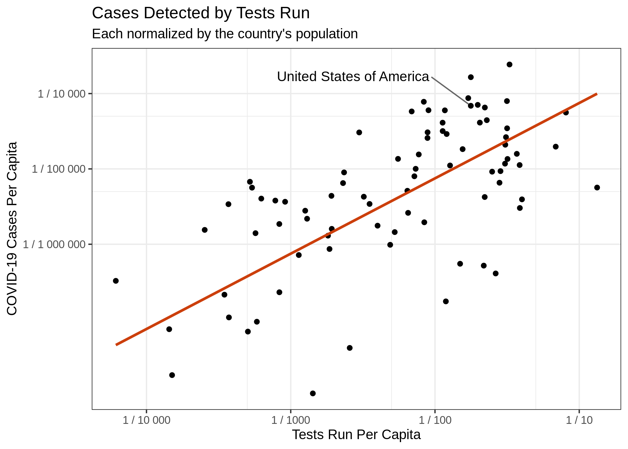 and death rates. Put simply, the more tests you perform, the more
cases you will detectthough the percentage of positive tests out of tests performed will usually
decrease. This correlation is largely driven by insufficient testing, but is particularly difficult from a
statistical perspective, because we are not testing randomly. Instead, most countries are testing
individuals who present to a hospital (or clinic) with symptoms. This means we are grossly
underestimating the actual number of cases (especially missing asymptomatic ones) and also inflating
our calculations of deaths per confirmed case
(“case fatality”) by essentially substituting a small portion of casesand more specifically only individuals who meet testing
criteria in their locality for the total population prevalence. As testing gets
better, case fatality will become a more meaningful metric and a more useful point of comparison
between countries.
and death rates. Put simply, the more tests you perform, the more
cases you will detectthough the percentage of positive tests out of tests performed will usually
decrease. This correlation is largely driven by insufficient testing, but is particularly difficult from a
statistical perspective, because we are not testing randomly. Instead, most countries are testing
individuals who present to a hospital (or clinic) with symptoms. This means we are grossly
underestimating the actual number of cases (especially missing asymptomatic ones) and also inflating
our calculations of deaths per confirmed case
(“case fatality”) by essentially substituting a small portion of casesand more specifically only individuals who meet testing
criteria in their locality for the total population prevalence. As testing gets
better, case fatality will become a more meaningful metric and a more useful point of comparison
between countries.
Fourth, COVID-19 was introduced to countries at different times. This means that one country might be in a period of exponential growth, while another country is winding down. To compare overall disease trajectories, it is therefore necessary to normalize this timeline. The usual way to do this is to set day “0” to be the day each country reached some threshold value for the metric of interest. For example, the day each country reached 1 death per 1 million peopleput another way, the day on which the number of deaths divided by the population was greater than or equal to 0.000 001.
Finally, there are issues of how cases are defined and how deaths are assigned. Moreover, this definition has changed both between countriesOnder, Graziano, Giovanni Rezza, and Silvio Brusaferro. “Case-fatality rate and characteristics of patients dying in relation to COVID-19 in Italy.” JAMA (2020), and over time within the same countryTsang, Tim K., et al. “Effect of changing case definitions for COVID-19 on the epidemic curve and transmission parameters in mainland China: a modelling study.” The Lancet Public Health (2020), over the course of this pandemic. Fortunately, there seems to be convergence on these definitions, so this is becoming less of a problem (especially for comparing developed nations) as time goes on.
So what are we supposed to do?
All of the above complexity leads us to a somewhat bleak perspective. No matter which two countries are compared, there will always be a “just-so” story that can be concocted to invalidate the comparison. Yet, such comparisons are essential to learning from this experience and improving responses in the event of another wave and/or the next pandemic.
So we make the best comparisons we can, normalizing for as many of the differences as possible. This means:
-
Compare per capitathe number of cases/deaths/etc. per individual in the population values rather than raw numbers, incorporating population density and demographics when possible.
-
Use numbers of deaths over number of cases (at least until testing reaches a sufficient level for case fatality rates to be reliable). While there are also issues with counting deaths related to COVID-19, it suffers from less variability than does number of cases, and is less biased by testing rates. Moreover, this is the most important number from a public health perspective. The number of cases is rather irrelevant in the absence of severe health outcomes.
-
Be sure to align countries’ epidemic curves before comparing them so that countries are compared at similar points along their respective epidemic trajectories.
All of these considerations are taken into account in the figure popularized by The Financial Times and used by my favorite COVID-tracking site 91-DIVOCcheck out this great video explaining these three points.
A case study: Sweden
Sweden has been in the US news a lot lately as an outlier in their governmental response to COVID-19. While the evaluation of their strategy is rapidly becoming a partisan enterprise, let’s see what the data show about their response, trying to keep as much nuance in the discussion as possible. To help account for both demographic and environmental confoundersvariables that are correlated with the measures we care about, making it difficult to say which is (are) the “true” cause of the change we see, we will specifically compare Sweden against it’s immediate neighbors: Norway, Finland, and Denmark.
Let’s use these data for comparison.
As of 4 May, Sweden has almost 260 deaths per 1 million people, followed by Denmark with 83, Finland with 42, and Norway with 39. Normalizing by the date of COVID-19 introduction, we can step back to “Day 37” since 1 death / million population (this is the latest date with all four countries represented). This corresponds to May 4th for Finland, April 26th for Sweden and Denmark, and April 25th for Norway. At this point, the death rates are Sweden: 212, Denmark: 72, Finland: 42, and Norway: 37. Put simply, Sweden has nearly three times the death rate of its next nearest neighbor and has the 10th highest death rate of all countries reporting at that time8th if we exclude San Marino and Andorra, whose combined land area measures approximately 200 mi2 – roughly the amount of parking space in LA County – and whose populations sum to just over 100 000. This is despite having less than 1.25 times as many confirmed cases as the next highest Nordic country.
A caveat
It is important to note that current death rates are not the only metric to consider when comparing countries. Indeed, the numbers we really want to compare are the true case fatality and the final death rates, after the pandemic has passedor at least moved into more of an endemic role, where we have seasonal outbreaks like with influenza. Perhaps Sweden will suffer less of a “second-wave” because of its less restrictive lock-down now. It is hard to say whether or not they have greater population exposure, and thus more herd immunitya situation in which disease spread is inhibited by a large fraction of the population already being immune, because of insufficient testing. Herd immunity relies on a large proportion of the population contracting the disease at some point, but the difference in prevalence is not so great between Sweden and other European countries according to the data reported so far.
One of the main reasons for governmental intervention in response to the pandemic has been to “flatten the curve” and prevent an overwhelming of the health care system. Since none of these countries has had their health systems overwhelmed, it remains a worthwhile question why Sweden has such a higher death rate at this time.